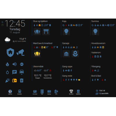
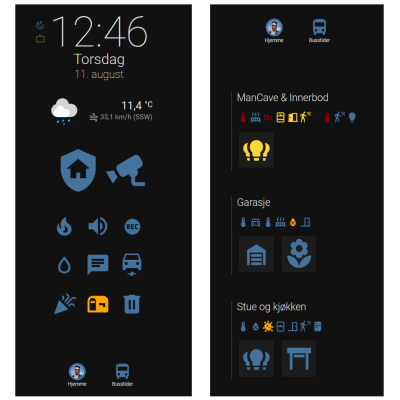
Have you ever wanted a smart home dashboard that adapts to the mobile phone in your pocket, any wall mounted standard tablets or to your laptop? I always wanted it, and luckily, the flexibility and openness of Home Assistant makes it possible.
This article will outline the major design principle and building blocks needed to make responsive Home Assistant dashboards. I'll also provide full code examples.
After reading the article, you should be able to make both a tablet and a mobile adapted dashboard, without duplicating code:
Also, check out this video:
Grid templates and media queries
There are many takes on building adaptable dashboards in home assistant, but I opted for grid templates with media queries. This is the web industry standard for defining rows, columns and areas in a responsive way in front end applications. The problem is, this method isn't officially supported by Home Assistant. Luckily, Home Assistant has a great community, and through an awesome custom plugin by Thomas Loven, called layout-card, you get the grid template capability.
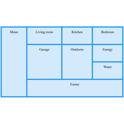
With the layout-card plugin, you can define a set of core areas for your dashboard, and organize these areas differently depending on your screen width. For your tablet and mobile, you may have a menu and some rooms like this:
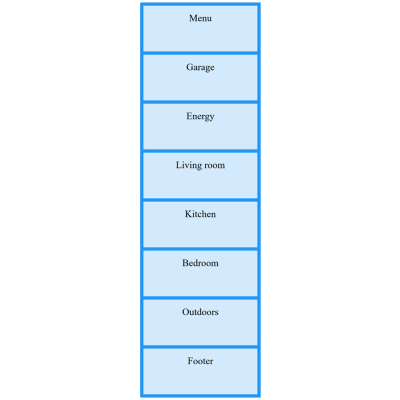
For your mobile phone, you probably want to have the most important areas at the top, and being able to scroll downwards for the rest, restricting the dashboard width to your device width, like this:
All this can be achieved in a single Home Assistant dashboard by assigning building blocks to named areas. The named areas are organized and prioritized using separate grid templates for different screen sizes. The screen sizes are detected with media queries. All is done with YAML. We’ll look into the details further on.
The building blocks
The building blocks make up the desired functionality, and are assigned to named areas in your grid templates. The building blocks can be standard entity cards, entity lists, etc., but for greater flexibility I strongly suggest looking into the custom plugin called button-card, made by RomRider.
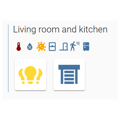
These are two examples of using custom button cards for defining basic building blocks for your dashboard.
Each building block has a distinct design and layout, and you can easily re-use the design and layout if needed. Custom button card layouts are also defined by grid templates, but for the time being, you can’t change the button card templates based om screen width.
Stitching it together
You should start out by creating your general design. Define your named areas and layout for different devices. It may help to sketch it out on paper first. When you have coded your named areas, grid templates and media queries in YAML, create your building blocks and assign them to the named areas. You may want to place several building blocks within an area. For this, you will typically start with a custom mod-card. This component is available through the custom plugin card-mod by Thomas Loven. The card-mod plugin allows you to control style of nested cards. I typically use 1 column grid for the first styling of each area (background-color, borders, padding, margins). Within the grid I may place vertical or horizontal stacks if needed.
Preparing for your own dashboard
Let’s get technical. First let’s prepare a blank dashboard. By default, dashboards are all defined in GUI, but we’ll want this dashboard to be defined in YAML. Go ahead and define your new blank dashboard in configuration.yaml like this:
lovelace:
  dashboards:
    smarthome-yaml:
      mode: yaml
      title: My dashboard
      icon: mdi:home-assistant
      show_in_sidebar: true
      filename: my-dashboard.yaml
You will need to restart HA in order for this blank dashboard to load. But prepare the my-dashboard.yaml-file first like the following:
button_card_templates: !include my-dashboard/button_card_templates.yaml

resources:
  - url: /hacsfiles/frigate-hass-card/frigate-hass-card.js
    type: module

kiosk_mode:
  hide_header: true

views:
  - type: custom:grid-layout
    path: 0
    layout:
      #default
      margin: 0
      grid-gap: 15px
      grid-template-columns: 300px repeat(3, 1fr) 0fr
      grid-template-rows: 15px repeat(3, fit-content(100%)) 55px
      grid-template-areas: |
        "sidebar . . . ."
        "sidebar room1 room2 room3 ."
        "sidebar mancave garage laundry ."
        "sidebar outdoors hallways entrance ."
        "footer_people footer_servers footer_toys footer_energy ."
      mediaquery:
        #phone
        "(max-width: 800px)":
          grid-gap: 40px
          grid-template-columns: auto
          grid-template-rows: auto auto 0px repeat(12, auto)
          grid-template-areas: |
            "sidebar"
            "footer_people"
            "."
            "mancave"
            "garage"
            "room1"
            "room2"
            "room3"
            "laundry"
            "hallways"
            "entrance"
            "outdoors"
            "footer_servers"
            "footer_toys"
            "footer_energy"
        #tablet
        "(max-width: 1200px)":
          grid-gap: 5px
          grid-template-columns: 300px repeat(3, 1fr) 0fr
          grid-template-rows: 40px repeat(3, min-content) 55px auto
          grid-template-areas: |
            "sidebar . . . ."
            "sidebar room1 room2 room3 ."
            "sidebar mancave garage laundry ."
            "sidebar outdoors hallways entrance ."
            "footer_people footer_servers footer_toys footer_energy ."
            ". . . . ."

    cards:
      - type: custom:button-card #extra_styles fix
        styles: { card: [display: none] }

      - type: custom:mod-card
        view_layout:
          grid-area: sidebar
        card:
          type: grid
          columns: 1
          square: false
          cards:
            - card:
                type: entity
                entity: binary_sensor.some_entity

      - type: custom:mod-card
        view_layout:
          grid-area: room1
        card:
          type: grid
          columns: 1
          square: false
          cards:
            - card:
                type: entity
                entity: binary_sensor.some_entity

      - type: custom:mod-card
        view_layout:
          grid-area: room2
        card:
          type: grid
          columns: 1
          square: false
          cards:
            - card:
                type: entity
                entity: binary_sensor.some_entity

   … etc …
This file is to be places in the config-directory in your HA installation. I recommend installing the Samba Share addon. Then you can create and edit all these files on your computer. If not, you get far by using the SSH & Web Terminal addon to create files, and the Studio Code Server to edit the files.
Note that the first line in the my-dashboard.yaml-file suggests including a template file. Create a directory below the config directory, and place an empty file with the same name as in the example config. The suggested template file will contain re-usable templates for your custom button cards, while the directory itself will contain several sub-components of your dashboard. You can see examples of this in the code referenced towards the bottom of the article.
Also, note that while GUI defined dashboards load custom plugins automatically, you may have to load them manually as resources in YAML mode. The Frigate custom plugin is an example of this.
On a side note; the “kiosk_mode” is a deprecated module that I (and many others) have forked (https://github.com/remimikalsen/kiosk-mode) in order to keep it alive until a viable alternative pops up. It makes the dashboard a lot nicer and focused. I recommend forking or installing a fork of this plugin.
The my-dashboard.yaml-file is a simple skeleton of your dashboard with no real functionality. You have a default layout defined one lines 14-24. Then, there are a couple of media queries that tweak this layout for other screen sizes. Note how the named areas are the same, but differently organized and spaced. You may read more about grid layouts on W3School.
The content itself is pretty nonsensical for now, and it’s defined when you get to the cards-section, where you map custom:mod-cards to different named grid areas within view_layouts. You must tweak the contents of the file to suit your general layout needs. After that, we’re happy and can restart HA in order to make the new, empty/nonsensical dashboard available. Building your dashboard
From here on, you are on your own, but please take a look at this screencast with examples from my dashboard, and check out complete code examples (redacted) on my GitHub. From here, you’ll be able to build your own personalized dashboards that fits both in your pocket, on tablets around your house and on your laptop when you’re developing.
